Month: April 2020

How it’s Going

For my project, I have been able to find a lot more research than I anticipated. That being said I am also running into plenty of difficulties. The databases I have used like ProQuest that perfectly fit what I need are almost always out of date, so I have to use it for historical aspects. I have been using a good amount of reliable internet sources like human rights campaign, glaad, gallup poll, and isidewith. I ran into multiple dead ends with researching databases until the discovery of Jstor text analyzer and Ramapo’s potter library online book search. I found one book that gives a vast history of LGBTQ+ evens all over the world involving all sorts of people. I finally found information about the Vietnam war and LGBTQ+ in the military during that time. On Jstor, I found information about DADT and actual accounts of how that affects non-LGBTQ+ and LGBTQ+ members. I also found information about gay church movements. My next step is talking about the Lavender scare and that was made extremely easy by a Jstor article I found. I am having trouble remembering what source said what though due to the massive amount of information I need that is spread out through many books and articles.

Sticking to Schedule

I am trying to stick to my schedule, but actually putting the information into my website it takes a longer time than I anticipated. I have been trying to trim down my website to make it easier, but it is difficult to choose what to exclude. For example, I cut down the history two to tabs, removed the people tab, removed the tab about military opinions, and so on. Now I have limited the research I have done on that and have now incorporated it into another tab. I have been able to finish the about me tab, the general information tab, half of the history tab, and two-thirds of the public opinion tab. I have to finish the solutions tab, the change and why tab, and the personal accounts tab. I hope to finish the public opinion and history tab this week and move on to the next tab, personal accounts. I hope each tab will take me a week to do.
Technology is NOT my Friend

Some technological challenges I have faced are me at a computer. I am awful with technology and have been struggling to navigate everything. I have finally gotten used to WordPress and do not mind using it. Tikitok looks nice but was difficult to use. I also figured out that you cannot embed the timeline on a website without paying, which is awful. I have also tried to include infographics but cannot seem to figure out how to use canva and other such online resources. My go-to is adding pictures and citing them or looking for an image labeled for reuse.

Overall

Overall the project is going well. It is going to be hard work, but I am hoping that in the end, it will all work out. I am glad I chose the topic I did because I am learning about something I am passionate about. I am also learning valuable skills that will help me as a history major, such as what and where to research, how to create a website about a historical topic and so on. (more…)

A Savory Dish of Data

When served a savory dish, it can be easy to forget the time and effort required to prepare the dish that will only last 10-20 minutes. Similarly, it is easy to forget about the effort put in by statistical analysts to prepare a helpful infographic or statistical table that is only admired by its viewers for a minute or two. Behind every colorful graph, a team of people worked tirelessly to interview thousands of individuals as a reliable population or accurately perform delicate experiments. Moreover, the raw data they collect then needs to be cleaned, processed, stored, interpreted, and then finally laid out as an attractive chart. This tedious process is called data processing, which was summarized by Talend, “as starting with data in its raw form and converting it into a more readable format (graphs, documents, etc.), giving it the form and context necessary to be interpreted…”(1). In other words, making a reliable graph requires data collection and then data processing.

In order to obtain reliable data, researchers can conduct their own study or they can find the data from a trustworthy company or peer group that has already performed the study. Personally, I used the George T. Potter Library and Proquest Medline to acquire my statistics. At first, I found a survey called “AMERICANS’ VALUES AND BELIEFS ABOUT NATIONAL HEALTH INSURANCE REFORM.” that was conducted by the SSRS, an independent research company, for The Commonwealth Fund, The New York Times, and Harvard T.H. Chan School of Public Health (2). To clarify, the survey focuses on how an individual’s standpoint on the medicare problem correlated with their view of various other subjects. After further research, I was surprised to find that most of the scholarly sources I acquired came with links to data on which the articles were based. However, I ultimately decided to use the first survey I found for several reasons. Not only does the AMERICANS’ VALUES survey provide clean data that is ready to be graphed, but it also provides a wide variety of data sets that correlate individuals’ standpoints on the medicare problem with their view of various other subjects. In other words, the data provided by the survey is both clear and flexible since the data connects to different subjects. This flexibility can allow me to use the data to answer a variety of questions and fit data graphics into various areas of the website. For instance, the most straightforward question I can ask the data is which percentage of Americans support single-payer healthcare, but this question would only scratch the surface. Another question I could ask is how approval of government-run federal programs correlates with preferred medical plans, which can be an important graph for the “other social programs” page of the website where I will theorize that the success of other social programs in the U.S. reflects positively on single-Payer healthcare. The only downside of this survey is that it was conducted only by phone which limits the type of people that could take the survey. On the other hand, using the data sources provided by the scholarly articles seemed like an unnecessary risk since I had no way of knowing how clean, relevant, or flexible the data sources are. In essence, I decided to use the survey because of its advantages and because of the risks associated with using the data sources provided by the scholarly articles.  

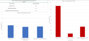
Despite the effort that goes into data collection and then data processing, the final step of data processing, the visualization of data, is the most important. Not only is the visualized data the final product of the whole tiring process, but according to Govex the visualized data is also meant “to influence the decision of your viewers…and direct their attention to the relevant parts of your visual”(3). In other words, the visual is supposed to convey a message to the viewer and the visual should make the data that conveys that message clear. For instance, the image below displays Table A from the survey graphed using two deferent methods. By changing the scale of the bar charts the same data can appear vastly different. In graph 1 the difference in percentages is clear but in graph 2 the difference in the percentages looks negatable. To conclude, it is important to consider the impact of the visualized data on the viewers and how different methods of visualization can change this impact.

Data from (2)

Footnotes:

  1. Pearlman, Shana. “What Is Data Processing? Definition and Stages – Talend Cloud Integration.” Talend Real-Time Open Source Data Integration Software. Accessed April 1, 2020. https://www.talend.com/resources/what-is-data-processing/.
  2. “AMERICANS’ VALUES AND BELIEFS ABOUT NATIONAL HEALTH INSURANCE REFORM.” The Commonwealth Fund, The New York Times, and Harvard T.H. Chan School of Public Health by SSRS, October 2019. https://cdn1.sph.harvard.edu/wp-content/uploads/sites/94/2019/10/CMWF-NYT-Harvard_Final-Report_Oct2019.pdf.
  3. Benison, Michael, and Michael Benison. “6 Ways Your Data Visualizations Can Influence Decisions.” Johns Hopkins Center for Government Excellence. Accessed April 1, 2020. https://govex.jhu.edu/wiki/influencing-decisions-with-data-visualizations/.


This image illustrates what data sets look like in a more visual form. Photo by Luke Chesser on Unsplash

Because my topic is somewhat niche and slightly narrow, I was able to find scholarly articles on the topic but not as much data that I can import directly into Tableau. However, I have done a lot of extensive research, therefore, I will be conducting my own data that I can input into Tableau so that I can still utilize the tool with a more compatible data set. The data that I will be conducting and inputting will illustrate the number of mental health programs accessible to students at the forty-seven colleges of the state. Thanks to the advice of my professor, I will also include not just the number of programs, but college tuition, median income after graduation, graduation rates, and other information that may provide a deeper analysis of mental health care for college students in New Jersey.

Prior to making the decision of conducting my own data, I had searched through databases such as Pew Research Center, Gallup, and social science-based journals through ProQuest. As I discussed in my project contract, I did find a few data sets through Gallup and Pew Research Center. For the two found through Gallup, they broke down the information from a different perspective than what I am used to seeing. Gallup organized their data by generations. (1) This is an important data set because as times and society have modernized, it is essential to recognize that studies have shown that younger generations have a higher rate of mental health disorders than older ones. The Gallup poll connects this parallel by showing that the boost of technology use is the reason for the increase in mental health disorders among younger generations.

This image is another example of the different ways data can look like visually. Photo by Lukas Blazek on Unsplash

The Pew Research data set I found was also fairly unique as it took a more direct approach to find information on mental health among younger generations, specifically aged 13-17. (2) A group of teens were given a list of topics where they each had to vote what they believed to be the most prevalent issue among their peers. The top issues were anxiety and depression. Though this survey was conducted in 2018, I can only imagine that this number has since risen. Another aspect of the study also explains as to why it is important to look at graduation rates at different colleges for my own research project. The Pew Research Center looked at which students’ anxiety was originating from the pressure to do well in school in order to get into a good college. Though the greatest difference between the research done by The Pew Research Center and me is the group that is being surveyed, the source of a mental health disorder is the same: feeling pressured to do well in school in order to be more successful later in life.

Tying it back to my own data and project, I think it will be slightly easier to process and visualize the data because since I am compiling the data on my own, I have more control over it and how it is organized. It definitely will be more work compared to other topics that already have relevant and specific data sets out there, however, I am excited to see what I can find and actually create a data set on my own.

References:

  1. Wolf, Ryan. “Wellbeing by Generation: Where Some Thrive, Others Struggle.” Gallup.com. Gallup, February 28, 2020. https://www.gallup.com/workplace/268025/wellbeing-generation-thrive-others-struggle.aspx.
  2. Horowitz, Juliana Menasce, and Nikki Graf. “Most U.S. Teens See Anxiety, Depression as Major Problems.” Pew Research Center’s Social & Demographic Trends Project, January 5, 2020. https://www.pewsocialtrends.org/2019/02/20/most-u-s-teens-see-anxiety-and-depression-as-a-major-problem-among-their-peers/.

Initially, I wanted to focus my website project on immigration and its influence on economic disparities within the state of New Jersey.  I quickly found that finding sources that showed both the relation and correlation between immigration and economic disparities were not common and often separated the two categories from one another instead of in a more comparative manner.  I looked on sites such as JSTOR and ProQuest for my qualitative data, while I turned to sources such as the Bureau of Economic Analysis for my quantitative data.  Since I could not find data supporting the linking of my social issue, I reconfigured my topic to focus on immigration within New Jersey.

The whole process of finding a data source that is useful for my website project involved first looking at sources found on JSTOR and ProQuest.  Here, I was able to locate plenty of argumentative pieces that either advocated or rejected the ideas of immigration benefitting society as a whole.  These engines gave me choices from several sets of data and offered a wide range of perspectives, which is useful in the overarching goal of my website: to allow individuals to formulate their opinions based on unbiased data presented to them.  For more statistical and quantitative data, I plan to continue to use https://datausa.io.  This site provides New Jersey data having to do with the economy, diversity, education, and housing and living.  My selection of sources is indicative of my main goal of wanting to provide a range of perspectives so that individuals can think freely and draw their own conclusions using the data provided throughout my website.  I did not want to focus so much on immigration benefits or drawbacks, but I wanted to focus more so of the role immigration plays in New Jersey as well as its effects within the economy, demographics, education, and diversity.  Creating a well-rounded website with a balanced focus on aspects of immigration will provide readers with backgrounds of more knowledge.  Some questions I want to ask my data include:

  1. How does immigration impact the economy?
  2. What is the history of immigration, and where do we see immigrant groups moving?
  3. Which populations of New Jersey face the most poverty?
  4. What populations/demographics are largest within New Jersey?
  5. Where do populations of immigrants usually move/congregate?
  6. What roles has immigration and diversity played on culture and lifestyle?

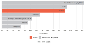
This image depicts the percentage of foreign-born residents in New Jersey compared to other areas of the country in 2017 (Data USA).

Immigration is a vast topic that can be dealt with using social sciences or more pragmatic methods such as economic factors, so a majority of fields would be able to answer these questions, including economics, business, education, humanities, and other social sciences.  Immigration affects more people than we realize. As of 2017, 22% of New Jersey residents were born outside of the United States (^1).  Compared to my last topic, the data used for immigration in New Jersey is much easier to handle and break down seeing that I can extrapolate information having to do with different fields instead of focusing solely on the economics and disparities associated with immigrants.  However, sources indicated that economic concerns dominate the worries of Americans due to the labor market and revenue (^2).  Data supports the notion that economics plays a large role in the perception of immigration.

Immigrants are critical contributors to the economy (Camoin Associates).

Most data usually requires cleaning or massaging to some degree in order to obtain the desired information, oftentimes because sources provide more data than is actually necessary.  I find that surveys are skewed at times because they depend on the honesty of respondents, and they may not answer every question completely truthfully, so data sources such as polls and surveys should be used with caution, as discussed in previous lectures.  Considering this, I will have to adjust it so that it provides readers insight to the topic from the general public’s perspective.  I do not foresee any problems with obtaining the necessary data, but one concerning issue is that recent data may be skewed as a reflection of the ongoing immigration debate throughout recent years.  Overall, the process of analyzing and visualizing data go together: after analyzing data, it is helpful to see its meaning and significance in the form of charts or graphs. It is easier for many to see effects versus reading about them.  It assists individuals in trying to comprehend data’s meaning and apply it to any given issue, and the process proves effective when wanting to draw conclusions of issues.

______________________________________________

Bibliography

(Image 2) Damicis, Jim, and Bethany Meys. “Immigrants Are Critical to the Economy.” Immigrants are Critical to the Economy | Camoin Associates, June 11, 2018. https://www.camoinassociates.com/immigrants-are-critical-economy.

(^2) Espenshade, Thomas J., and Vanessa E. King. “State and Local Fiscal Impacts of US Immigrants: Evidence from New Jersey.” Population Research and Policy Review 13, no. 3 (1994): 225-56. Accessed March 30, 2020. www.jstor.org/stable/40229734.

(Image 1 and ^1) “New Jersey.” Data USA. Accessed March 30, 2020. https://datausa.io/profile/geo/new-jersey#demographics.

css.php