Within New Jersey, I examined the demographics of Bergen County, Hudson County, and Middlesex County because they are the three counties in the state with the highest number of immigrants. My research throughout my site focused on qualitative data in order to evaluate the effects of immigration throughout the state of New Jersey (i.e. shown in the history, political debate, stories and causes, and sociological perspectives tabs). However, my pages for each of the three counties narrow their focus on quantitative data such as demographics to show immigration representation as well as diversity while examining different aspects unique to each county.
Depicted in the pie chart is the 2018 percentages of origins of foreign-born individuals within New Jersey:
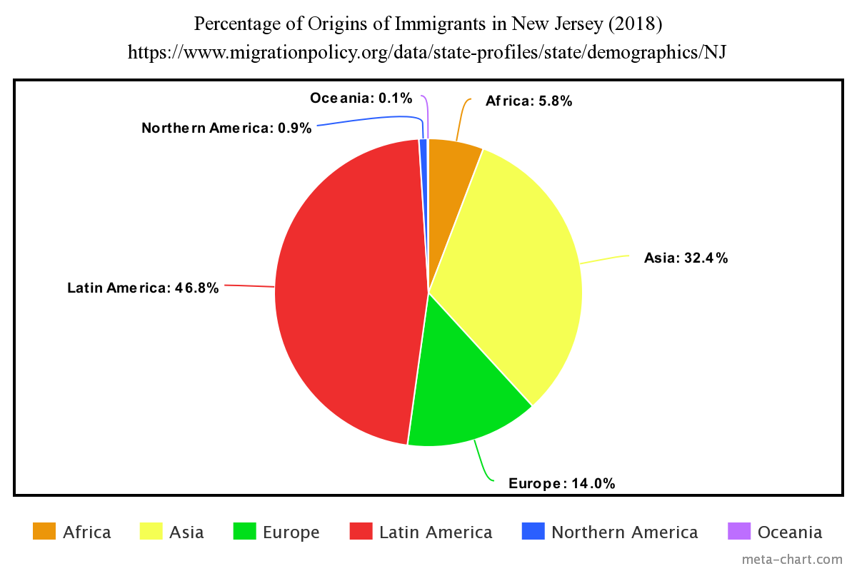
Nearly half of foreign-born individuals come from Latin America (46.8%). The least number of immigrants come from Oceania (0.1%). Despite the common misconceptions, the types of immigrants found throughout the state offer different advantages and assets to the community. See the three tabs listed under the name of this page for each county’s explanations.
____________________________________________________
Bibliography
“New Jersey.” Migration Policy Institute, 2018.